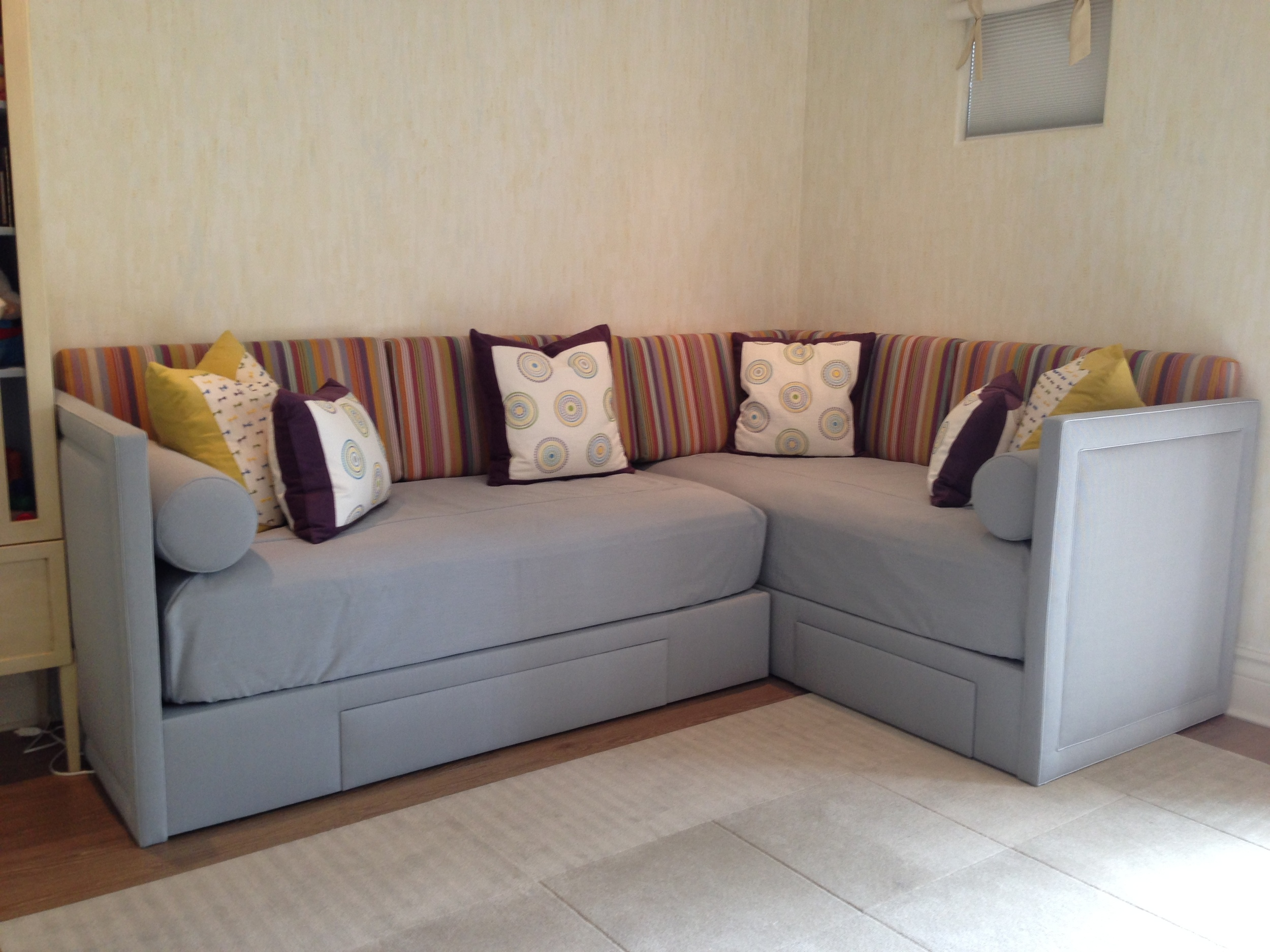
An atypical splash of color for a growing boy’s room. Statistically, boys prefer an interior with blue and green colors—but who is to say boys are not partial to the other colors on the spectrum?
This combination of fabrics is impartial towards color, sex, or time. It is designed to depict the joy of life in a setting that adapts to a baby boy’s changing moods and humors.
This fabric combination has a story behind it: when we started an interior design project in Miami, Florida for a young couple with a three-year-old daughter and a boy “on the way.” Plans were made for a total renovation of their house on the Miami waterfront with one room assigned for their daughter and another one for the baby boy.
Keeping in mind kids grow so fast, the nursery was designed for the transition from baby to toddler and from toddler to child, so we used a palette of soft muted yellows. The interior design concept we applied was subtle with touches of whimsy. We added hand-painted texture to the walls, and the ceiling is an interior design master piece depicting little stick-figure boys doing different activities like riding a bike and sailing, etc. Young and old alike enjoy finding the stick figures throughout the painting.
As the little boy outgrew his crib, a pair of custom beds was made in an L-shape keeping the room open allowing for ample play space and for little guests to spend the night in the second bed. The frames were upholstered in a heavy silvery-blue woven fabric which will last for years of boyish use and will appeal to boys no matter the age. For the cushions and the pillows we used the fun patterns as they add a splash of color without taking away from the rest of the décor and the painted ceiling. Conveniently the beds can be updated effortlessly simply by chainging the cushions with a color and pattern appropriate for the age while the understated background colors will transcend the trends.
- COLLIN, 10 / SACHO
- 30691-410 / KRAVET
- MILLSTONES, LEAF-BLUE-MAUVE / LEE JOFA
- PRIMA ALPACA, MULBERRY / SANDRA JORDAN
- PRIMA ALPACA, DAFFODIL / SANDRA JORDAN
- BOW TIE, GREEN-YELLOW-INDIGO / LEE JOFA


